A disciplined identity for PT Batu Kumala Mulia, designed to communicate control, trust, and forward movement across global trade relationships.
Role
Brand strategy, identity system, and art direction
Focus
International buyers and industrial partners
Direction
Gateway Momentum
The brand
A controlled gateway for global industrial trade.
PT Batu Kumala Mulia connects Indonesian coal supply with international buyers, power plants, steel manufacturers, and industrial partners. The identity needed to feel premium and authoritative while remaining practical across demanding operational environments.
01
The challenge
Strength without the category clichés.
Industrial energy brands often rely on literal coal, flames, barges, maps, mountains, or heavy visual effects. BKM needed a distinctive signal of reliability and movement without repeating those familiar symbols.
02
The direction
Control activated by momentum.
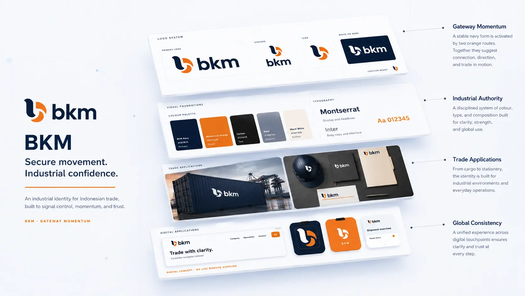
Deep navy establishes discipline and authority. Orange directional forms introduce connection and export movement. Broad geometry keeps the identity strong from a shipping folder to a container stencil.
The idea · Gateway Momentum
Two routes move through one controlled gateway.
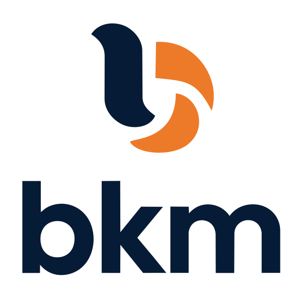
The abstract symbol pairs a stable navy form with two orange directional shapes. Together they suggest connected trade routes, decisive movement, and a trusted point of control.
ControlRouteMomentum
DESIGN DECISIONS
The decisions behind the system.
01
Establish control
Use a stable navy anchor as the consistent reference across trade and operational materials.
02
Introduce direction
The orange forms carry the interpretation of routes and momentum without adding literal transport imagery.
03
Protect reproduction
Keep the primary, stacked, monochrome and reverse signatures consistent across documents and field applications.
CONSTRUCTION RATIONALE
Broad forms and clear spacing keep the directional mark readable on freight containers, documents and field equipment.
Responsive identity
One idea. Room to adapt.
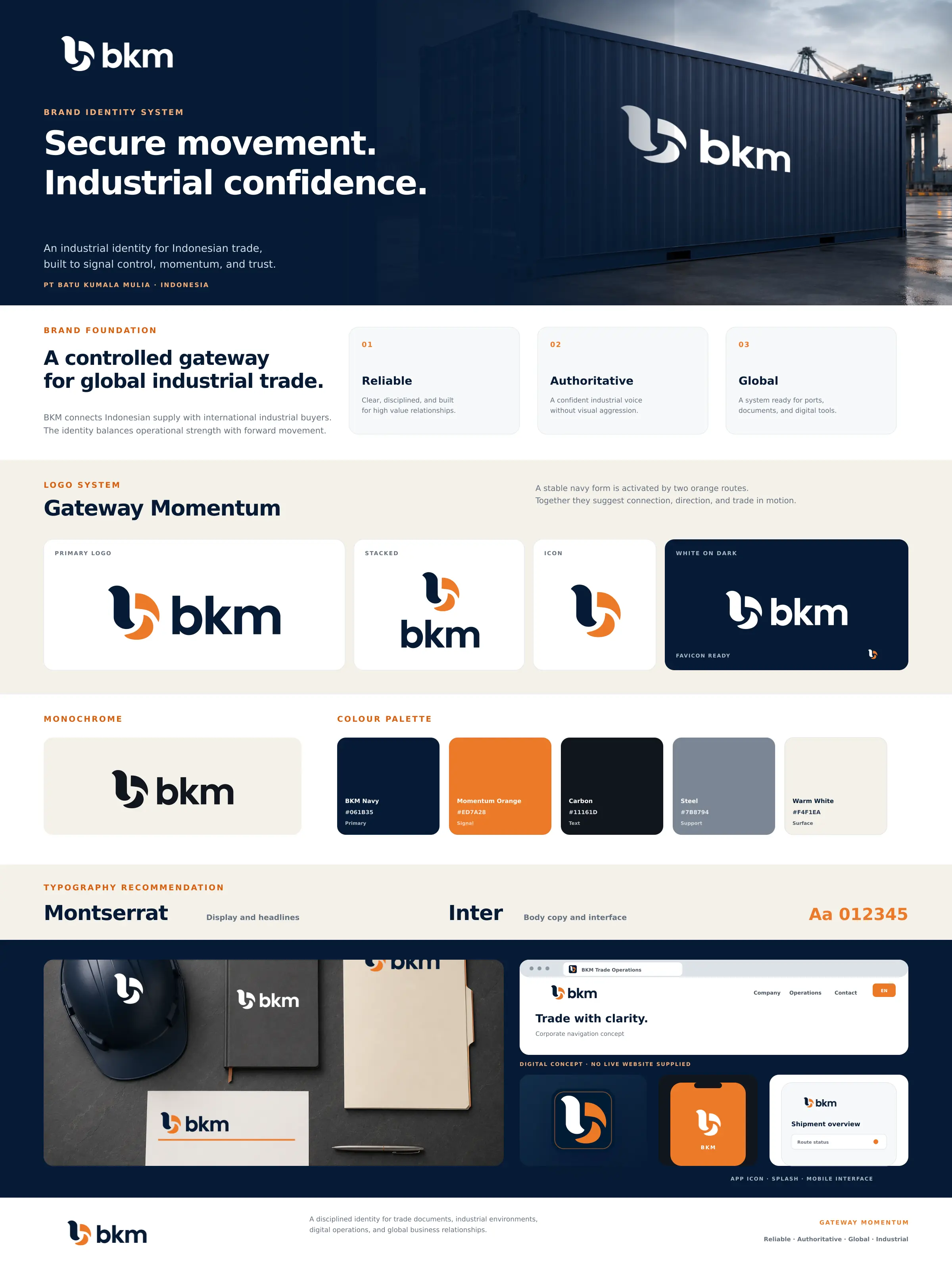
Primary signature
The full identity for navigation and wide compositions.
Stacked signature
A proportional arrangement for square and centred formats.
Symbol
The core silhouette where the name is already understood.
Single colour
A utility presentation for light surfaces and limited reproduction.
Reverse
A clear signature on a quiet dark background.
FaviconBrowser recognition
App iconA padded silhouette
Colour system
Authority at rest. Momentum in motion.
BKM Navy
#061B35Control and authority
Momentum Orange
#ED7A28Direction and energy
Carbon
#11161DText and utility
Steel
#7B8794Industrial support
Warm White
#F4F1EAPremium surface
The palette describes the identity’s visual roles. Colour meaning is a design intention; readable text uses a contrast-checked foreground on each surface.
Typography
Montserrat and Inter
Montserrat brings geometric authority to display moments. Inter keeps documents, dashboards, and operational interfaces clear at every size. The protected vector wordmark remains unchanged.
Aa
Move securely. Trade confidently.
Hierarchy study · proposed typography pairing
Expressive display
Readable supporting text
Protected wordmark
Clear hierarchy
Identity in use
Built for physical work and digital control.
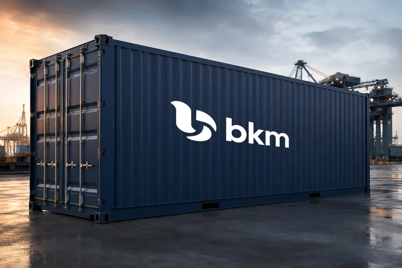
Container application
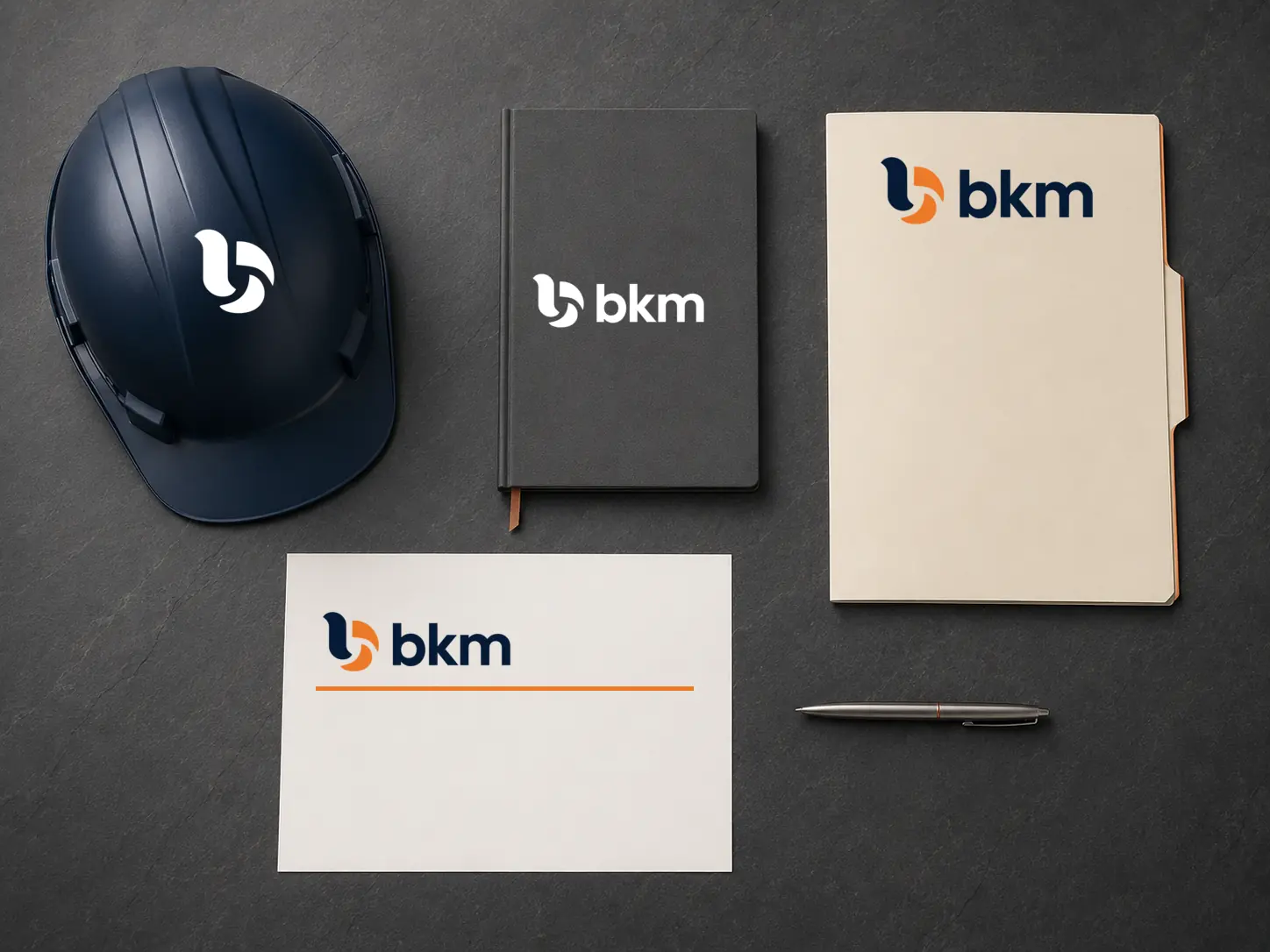
Industrial stationery and field assets
BKM
Browser identity concept
THE COMPLETE PICTURE
The identity, held together.
Outcome
The identity was applied to shipping documents, field equipment, containers, browser icons, and operational product concepts.
Primary and stacked signatures
Icon, monochrome, and reverse variants
Favicon and app icon
Colour and typography recommendation
Physical and digital concept applications
Bring me the difficult part.
Strategy, identity, and applications built as one system.