Skip to brand story
All brand workSIN

Industrial trade · Brand identity · 2026

Industrial confidence. From source to market.

A premium identity for PT Sumber Indonesia Nickel, designed to express mining origin, industrial authority, and readiness for global trade.

Role
Brand strategy, identity system, and art direction
Focus
International buyers and industrial partners
Direction
Nickel Crest
SIN identity shown across concept applications and brand materials

The brand

A premium source mark for Indonesian nickel.

PT Sumber Indonesia Nickel operates across nickel mining and trading in Indonesia. The identity needed to feel premium, industrial, and corporate while remaining practical across ports, documentation, field equipment, and future digital operations.

The challenge

Origin and authority in one mark.

The identity had to carry a clear Indonesian source cue while avoiding a generic mining badge. It also needed enough visual strength for containers and helmets, with enough refinement for international buyer communication.

The direction

Forged form, disciplined signal.

Graphite establishes industrial control. Warm orange brings energy and movement. Nickel silver adds a material reference, while broad geometry keeps the system legible from a shipping folder to a container application.

The idea · Nickel Crest

A forged S protects the source within.

The circular crest combines a sweeping S, an Indonesian source field, and a precise angular form. Together they create a confident symbol of origin, capability, and movement from source to market.

SIN final symbolSourceStrengthMovement

DESIGN DECISIONS

The decisions behind the system.

  1. Hold the source cue

    Keep the sweeping S and Indonesian source field within one circular crest.

  2. Balance weight and movement

    Broad graphite forms carry the industrial character; the orange accent supplies a directional signal.

  3. Extend the crest

    Use the same protected mark on trade documents, equipment and digital identity concepts.

CONSTRUCTION RATIONALE

The compact S silhouette and broad geometry carry the industrial identity across container markings, stationery and field assets.

Responsive identity

One idea.
Room to adapt.

SIN: Primary signature

Primary signature

The full identity for navigation and wide compositions.

SIN: Stacked signature

Stacked signature

A proportional arrangement for square and centred formats.

SIN: Symbol

Symbol

The core silhouette where the name is already understood.

SIN: Single colour

Single colour

A utility presentation for light surfaces and limited reproduction.

SIN: Reverse

Reverse

A clear signature on a quiet dark background.

SIN browser icon at 32 pixelsFaviconBrowser recognition
SIN app iconApp iconA padded silhouette

Colour system

Graphite authority. Industrial energy.

Graphite
#303030Industrial authority
Industrial Orange
#E16C26Energy and signal
Carbon
#11161DText and utility
Nickel Silver
#B7BCC2Material support
Warm White
#F4F2EDPremium surface

The palette describes the identity’s visual roles. Colour meaning is a design intention; readable text uses a contrast-checked foreground on each surface.

Typography

DIN Next and Inter

DIN Next brings engineered authority to display moments. Inter keeps documents, dashboards, and operational interfaces clear at every size. The protected vector wordmark remains unchanged.

Aa

Source confidently. Trade precisely.

Hierarchy study · proposed typography pairing
  • Expressive display
  • Readable supporting text
  • Protected wordmark
  • Clear hierarchy

Identity in use

Built for physical work and digital control.

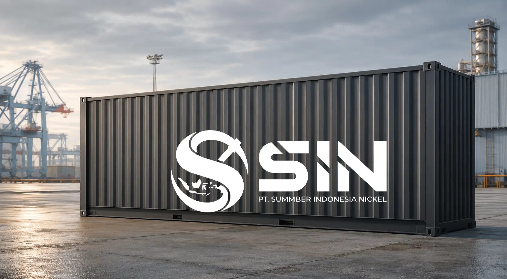
White SIN logo applied to a graphite freight container
Container application
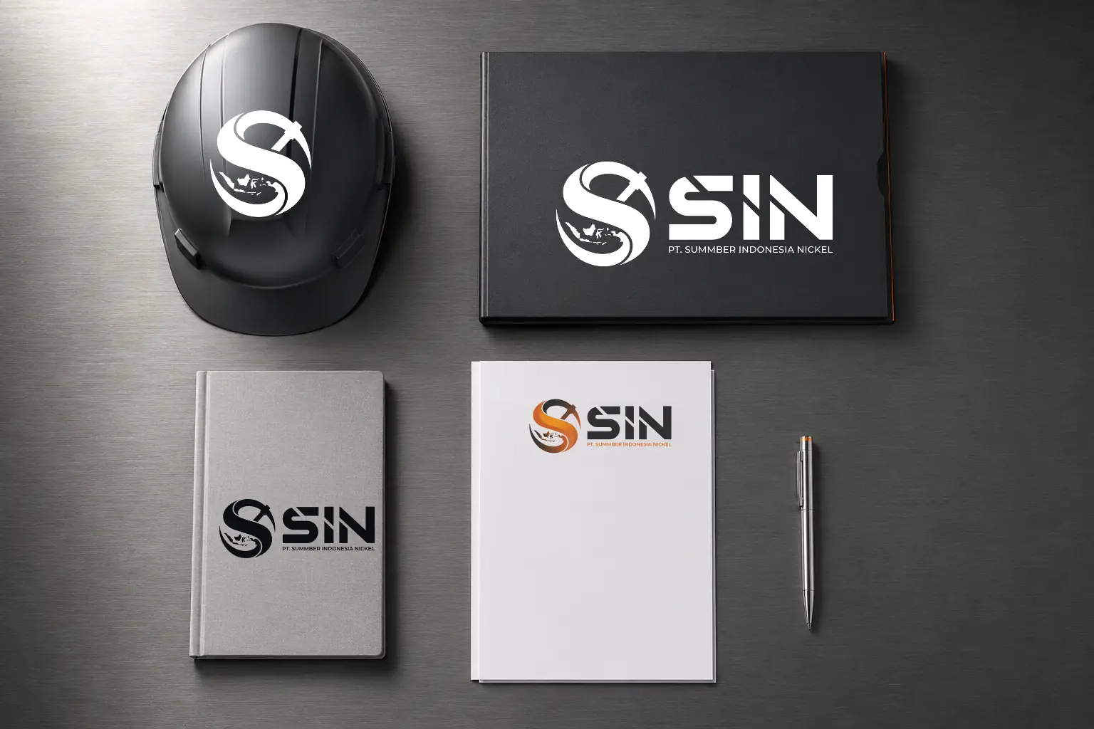
SIN identity applied to a helmet, notebook, folder, and letterhead
Industrial stationery and field assets
SIN
SIN symbol in a browser presentation
Browser identity concept

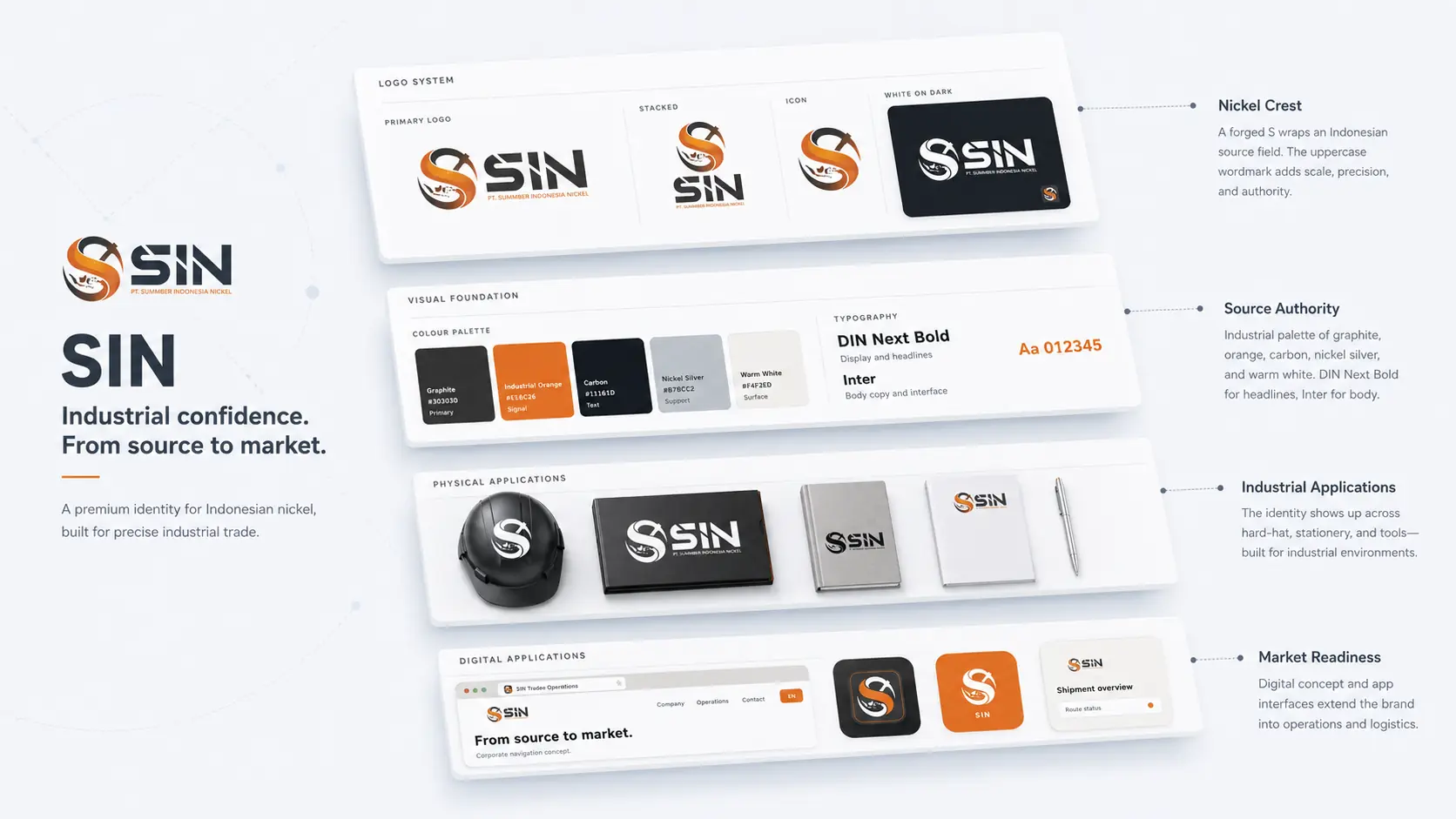
THE COMPLETE PICTURE

The identity,
held together.

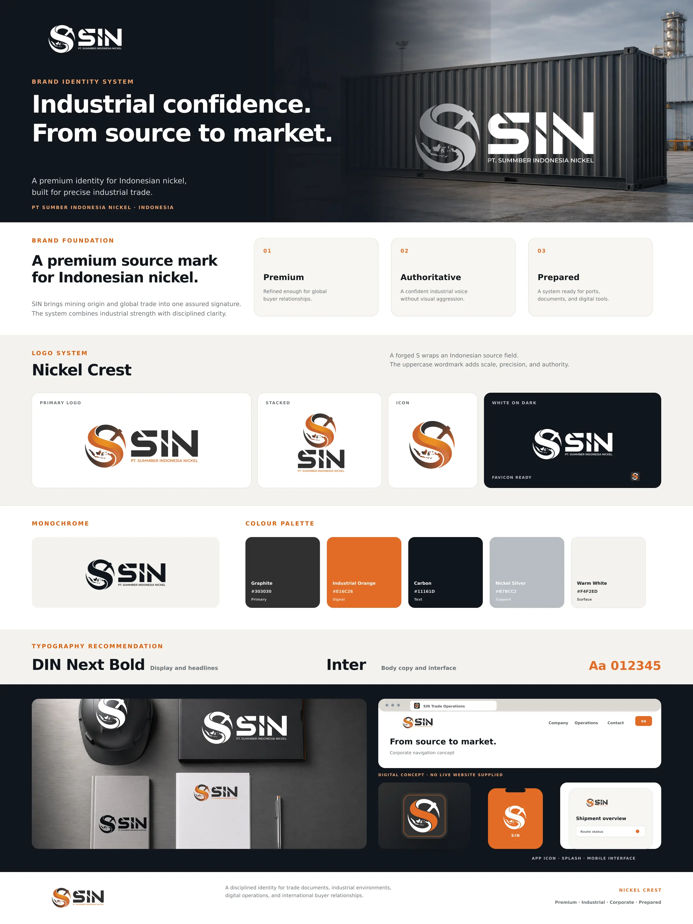
SIN complete brand board

Outcome

The identity was applied across trade documents, industrial environments, packaging, and future digital product concepts.
  • Primary and stacked signatures
  • Icon, monochrome, and reverse variants
  • Favicon and app icon
  • Colour and typography recommendation
  • Physical and digital concept applications

Bring me the difficult part.

Strategy, identity, and applications built as one system.

Discuss a brand challenge
About KowsikRésuméLinkedInEmail

Next identity

KESA Associates brand system