Skip to brand story
All brand workKESA Associates

Taxation and accounting · Brand identity · 2026

Established structure. Enduring trust.

A professional identity system that preserves the approved KESA Associates mark while giving it a clear, consistent presentation across physical and future digital touchpoints.

Role
Brand strategy, identity system, and art direction
Focus
Approved logo, category, and establishment year
Direction
Interlocked Assurance
KESA Associates identity shown across concept applications and brand materials

The brand

A formal identity shaped by structure and experience.

KESA Associates is confirmed by the supplied mark as a taxation and accounting firm established in 1989. No location, service list, client profile, or company history was supplied, so the identity story stays focused on the facts visible in the approved artwork.

The challenge

Extend a heritage mark without rewriting it.

The work needed to protect the exact geometry, company name, descriptor, year, proportions, and navy and gold relationship while building a dependable presentation system around the source logo.

The direction

Authority, heritage, and clarity.

Deep navy establishes professional structure. Heritage gold adds experience and distinction. Ledger cream creates a clear document surface, while stone and slate support restrained secondary information.

Proposed interpretation · Interlocked Assurance

Connected expertise in one stable monogram.

The navy K and heritage gold A interlock as one geometric unit. As a proposed interpretation, that relationship can suggest connected expertise, precision, and long term professional trust without claiming to be the original rationale for the mark.

KESA Associates final symbolStructurePrecisionTrust

DESIGN DECISIONS

The decisions behind the system.

  1. Preserve the supplied mark

    Keep the KA geometry, company name, descriptor and establishment year intact.

  2. Build around the identity

    Use navy, gold and ledger cream consistently across the supporting presentation system.

  3. Separate interpretation from history

    The interlocked-assurance reading is a portfolio interpretation, not a recovered account of the original logo design.

CONSTRUCTION RATIONALE

The supplied KA geometry, company name, descriptor and establishment year remain together. Supporting applications retain the original proportions.

Responsive identity

One idea.
Room to adapt.

KESA Associates: Primary signature

Primary signature

The full identity for navigation and wide compositions.

KESA Associates: Stacked signature

Stacked signature

A proportional arrangement for square and centred formats.

KESA Associates: Symbol

Symbol

The core silhouette where the name is already understood.

KESA Associates: Single colour

Single colour

A utility presentation for light surfaces and limited reproduction.

KESA Associates: Reverse

Reverse

A clear signature on a quiet dark background.

KESA Associates browser icon at 32 pixelsFaviconBrowser recognition
KESA Associates app iconApp iconA padded silhouette

Colour system

Professional authority. Established distinction.

Deep Navy
#0E1B29Authority and structure
Heritage Gold
#8F6F3CExperience and distinction
Ledger Cream
#F4F0E8Professional surface
Nickel Stone
#D8D1C5Quiet support
Slate
#64707BSecondary information

The palette describes the identity’s visual roles. Colour meaning is a design intention; readable text uses a contrast-checked foreground on each surface.

Typography

Manrope and Inter

Manrope brings measured geometric clarity to headlines. Inter keeps documents and interfaces easy to read at every size. This is a supporting recommendation only; the protected vector wordmark remains unchanged.

Aa

Established clarity. Dependable detail.

Hierarchy study · proposed typography pairing
  • Expressive display
  • Readable supporting text
  • Protected wordmark
  • Clear hierarchy

Identity in use

Built for professional spaces, documents, and future tools.

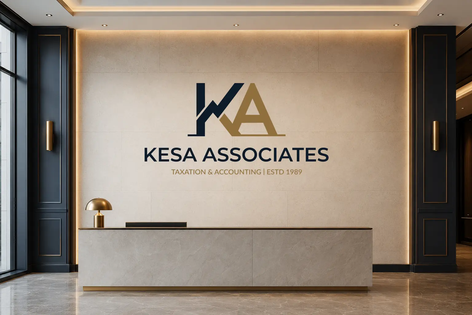
KESA Associates identity applied to an office reception wall
Office signage application
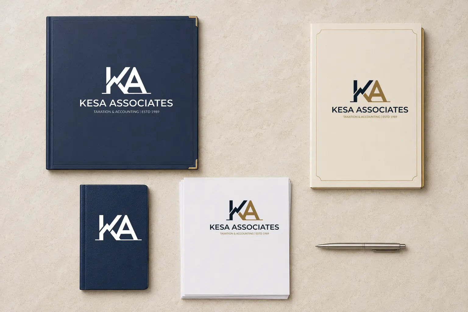
KESA Associates identity applied to report folders, letterhead, and a notebook
Accounting stationery and documents
KESA Associates
KESA Associates symbol in a browser presentation
Browser identity concept

THE COMPLETE PICTURE

The identity,
held together.

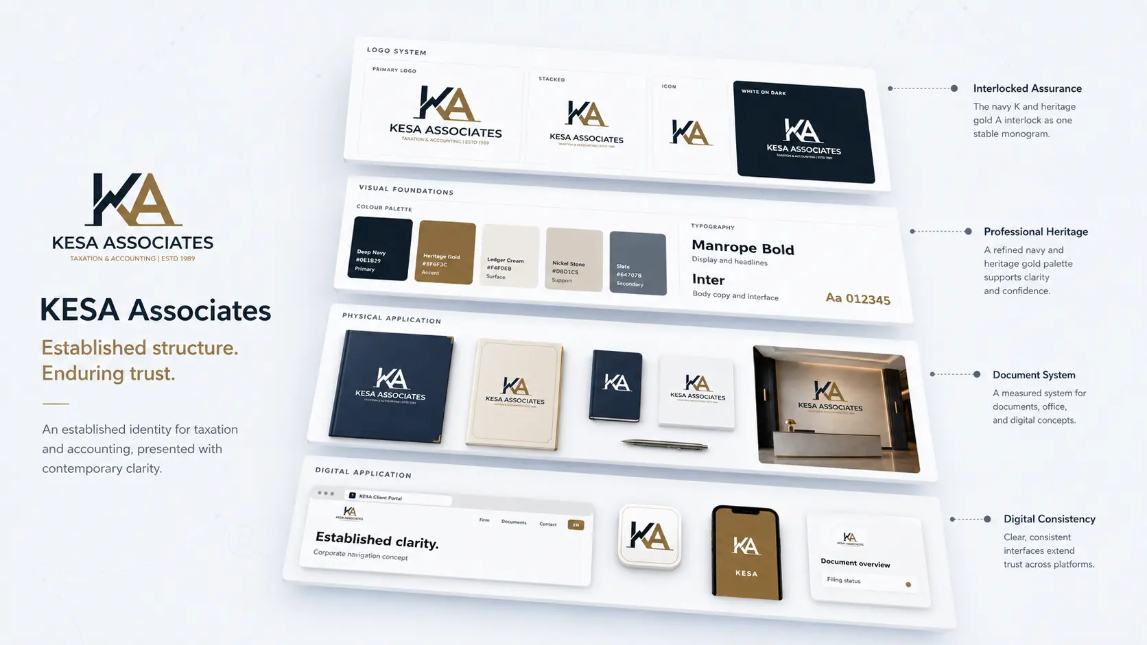
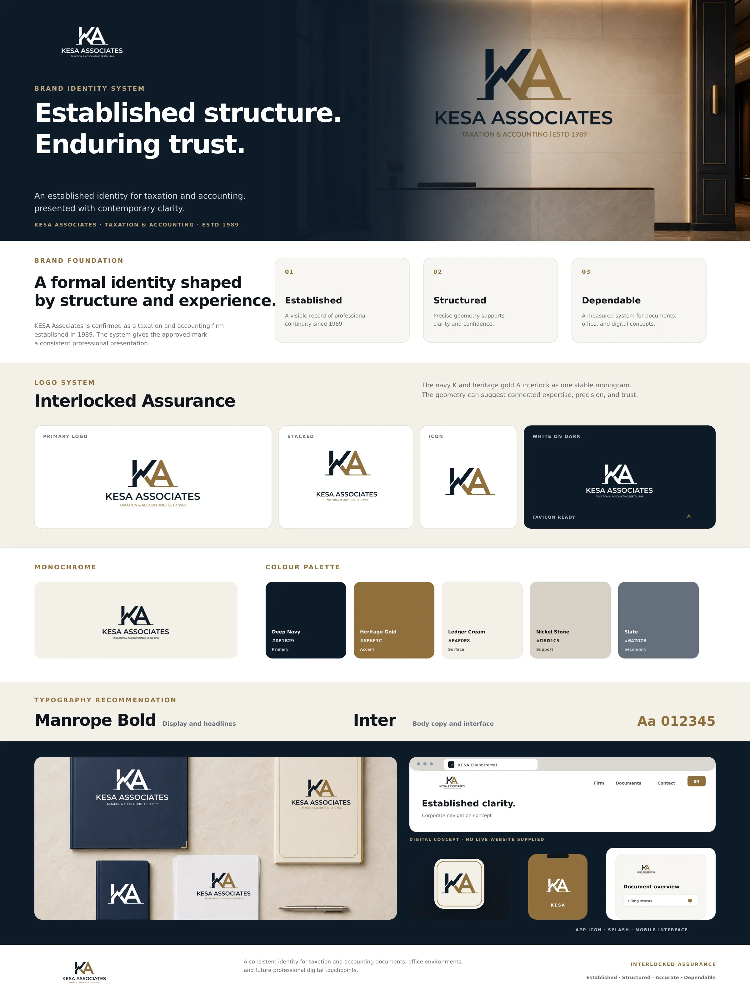
KESA Associates complete brand board

Outcome

The approved KESA Associates mark was applied across documents, office environments, and future digital touchpoints.
  • Primary and stacked signatures
  • Icon, monochrome, and reverse variants
  • Favicon and app icon
  • Colour and typography recommendation
  • Physical and digital concept applications

Bring me the difficult part.

Strategy, identity, and applications built as one system.

Discuss a brand challenge
About KowsikRésuméLinkedInEmail

Next identity

Gamooga brand system