Skip to brand story
All brand workGamooga

Customer engagement · Brand identity · 2026

Every channel. One personal journey.

A connected identity system for Gamooga, bringing its established red mark into a clearer presentation for enterprise marketing, customer journeys, and future product surfaces.

Role
Brand research, identity system, and art direction
Focus
Marketing, growth, customer relationship, and product teams
Direction
The Active Customer
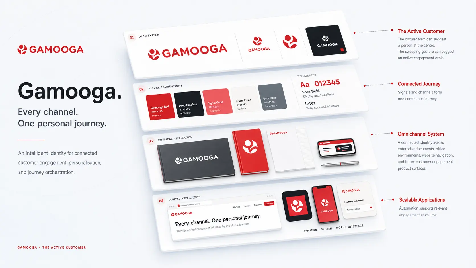
Gamooga identity shown across concept applications and brand materials

The brand

Customer signals become one connected experience.

Gamooga positions itself as an AI powered omnichannel marketing automation platform. Its published capabilities include dynamic segmentation, marketing automation, personalisation, analytics, recommendations, journey building, and channel optimisation across email, SMS, push, web, applications, and voice.

The challenge

Build consistency around an active legacy mark.

The identity needed to preserve the exact supplied geometry and red colour while creating reliable forms for wide, compact, small scale, monochrome, reverse, physical, and interface applications.

The direction

Human energy with enterprise control.

Gamooga Red carries action and recognition. Deep Graphite introduces enterprise authority. Warm Cloud gives the system breathing room, while Signal Coral and Data Slate support restrained data and interface emphasis.

Proposed interpretation · The Active Customer

Keep the individual at the centre of every journey.

The circular upper form can be read as a person or customer, while the sweeping lower gesture can suggest an engagement orbit or connected flow. This is a proposed portfolio interpretation informed by the platform positioning, not a claim about the original design rationale.

Gamooga final symbolCustomerSignalJourney

DESIGN DECISIONS

The decisions behind the system.

  1. Protect recognition

    Preserve the supplied red mark and its established geometry across every lockup.

  2. Organise the supporting system

    Pair red with graphite and quiet surfaces so the identity can support complex information.

  3. Explain the visual reading

    The customer-and-orbit interpretation connects the artwork to engagement; it does not claim to be the original design rationale.

CONSTRUCTION RATIONALE

The supplied raster mark retains its geometry and red colour. Wide, compact and reverse presentations give the same identity room to adapt.

Responsive identity

One idea.
Room to adapt.

Gamooga: Primary signature

Primary signature

The full identity for navigation and wide compositions.

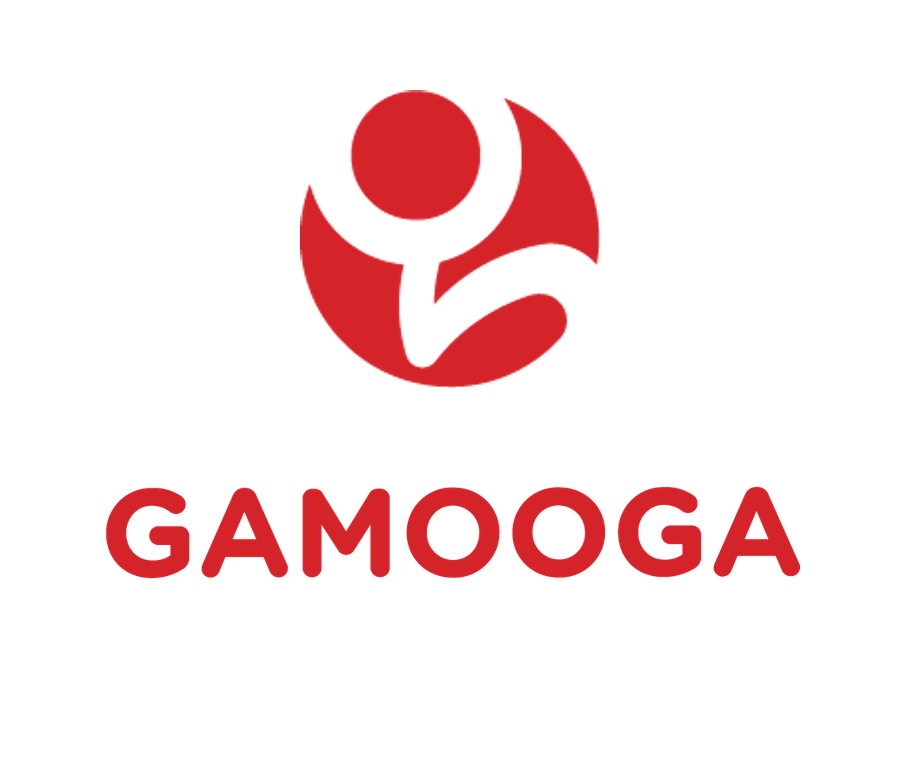
Gamooga: Stacked signature

Stacked signature

A proportional arrangement for square and centred formats.

Gamooga: Symbol

Symbol

The core silhouette where the name is already understood.

Gamooga: Single colour

Single colour

A utility presentation for light surfaces and limited reproduction.

Gamooga: Reverse

Reverse

A clear signature on a quiet dark background.

Gamooga browser icon at 32 pixelsFaviconBrowser recognition
Gamooga app iconApp iconA padded silhouette

Colour system

Active signal. Intelligent control.

Gamooga Red
#D42329Action and recognition
Deep Graphite
#171A21Enterprise authority
Signal Coral
#EF6166Data emphasis
Warm Cloud
#F7F4F1Accessible surface
Data Slate
#68717CSecondary information

The palette describes the identity’s visual roles. Colour meaning is a design intention; readable text uses a contrast-checked foreground on each surface.

Typography

Sora and Inter

Sora brings rounded geometric confidence to headlines. Inter keeps reports and interfaces clear at every size. This is a supporting recommendation only; the supplied raster wordmark remains protected and unchanged.

Aa

Reach personally. Learn continuously.

Hierarchy study · proposed typography pairing
  • Expressive display
  • Readable supporting text
  • Protected wordmark
  • Clear hierarchy

Identity in use

Built for enterprise spaces, campaign work, and product journeys.

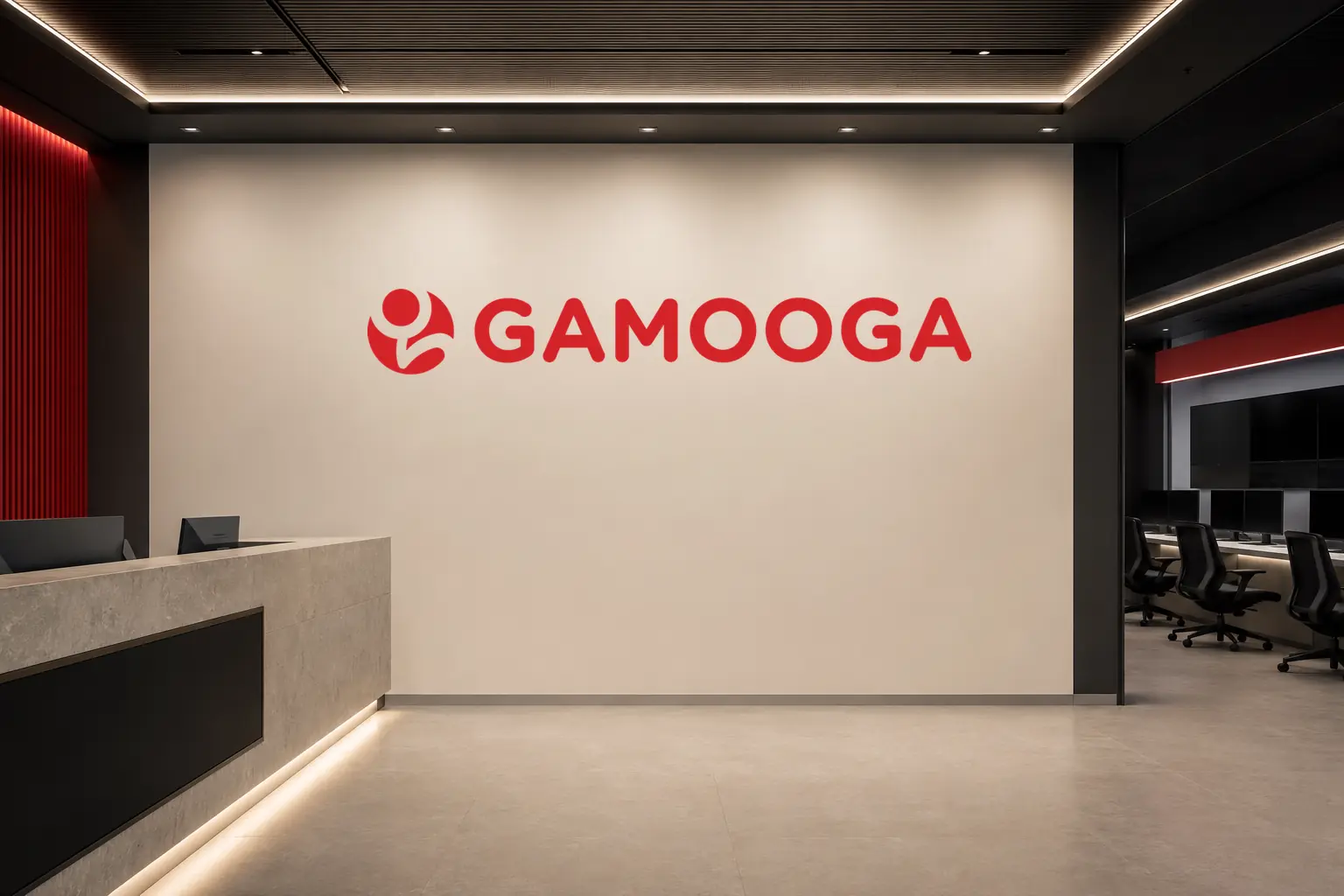
Gamooga identity applied to an enterprise technology office reception
Office signage application
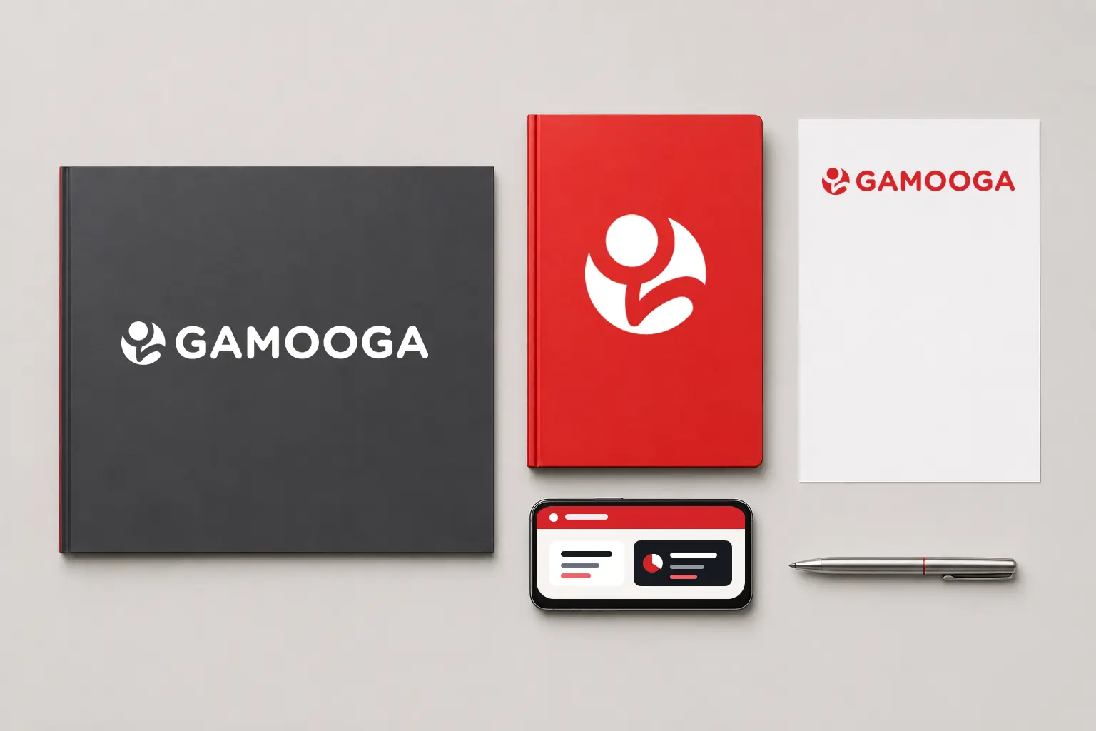
Gamooga identity applied to a report folder, notebook, letterhead, and mobile interface
Enterprise stationery and product concept
Gamooga
Gamooga symbol in a browser presentation
Browser identity concept

THE COMPLETE PICTURE

The identity,
held together.

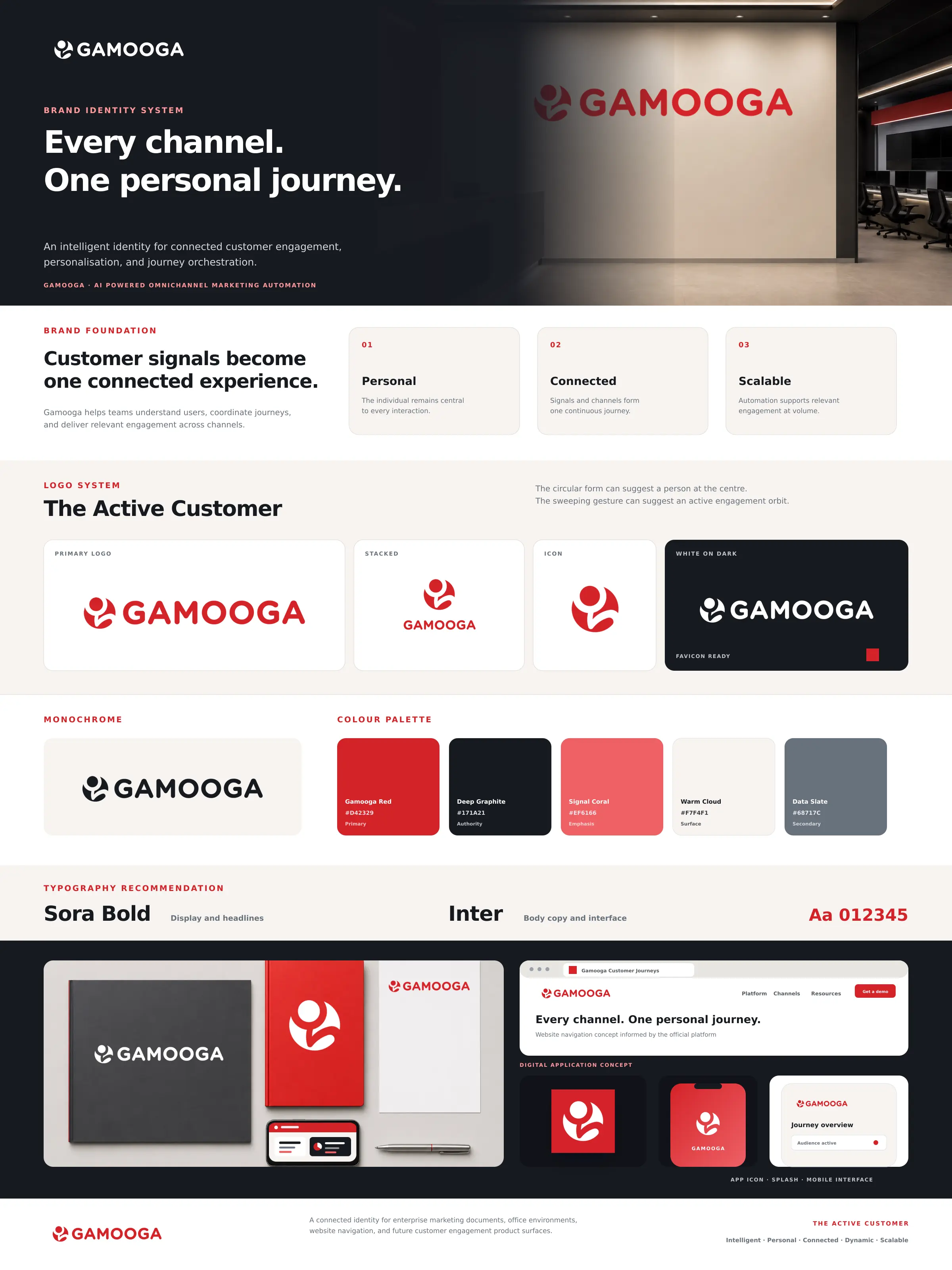
Gamooga complete brand board

Outcome

The approved red mark was retained and applied across enterprise communication, office environments, and customer-engagement product concepts.
  • Primary and stacked signatures
  • Icon, monochrome, and reverse variants
  • Favicon and app icon
  • Colour and typography recommendation
  • Physical and digital concept applications

Bring me the difficult part.

Strategy, identity, and applications built as one system.

Discuss a brand challenge
About KowsikRésuméLinkedInEmail

Next identity

Nitya brand system