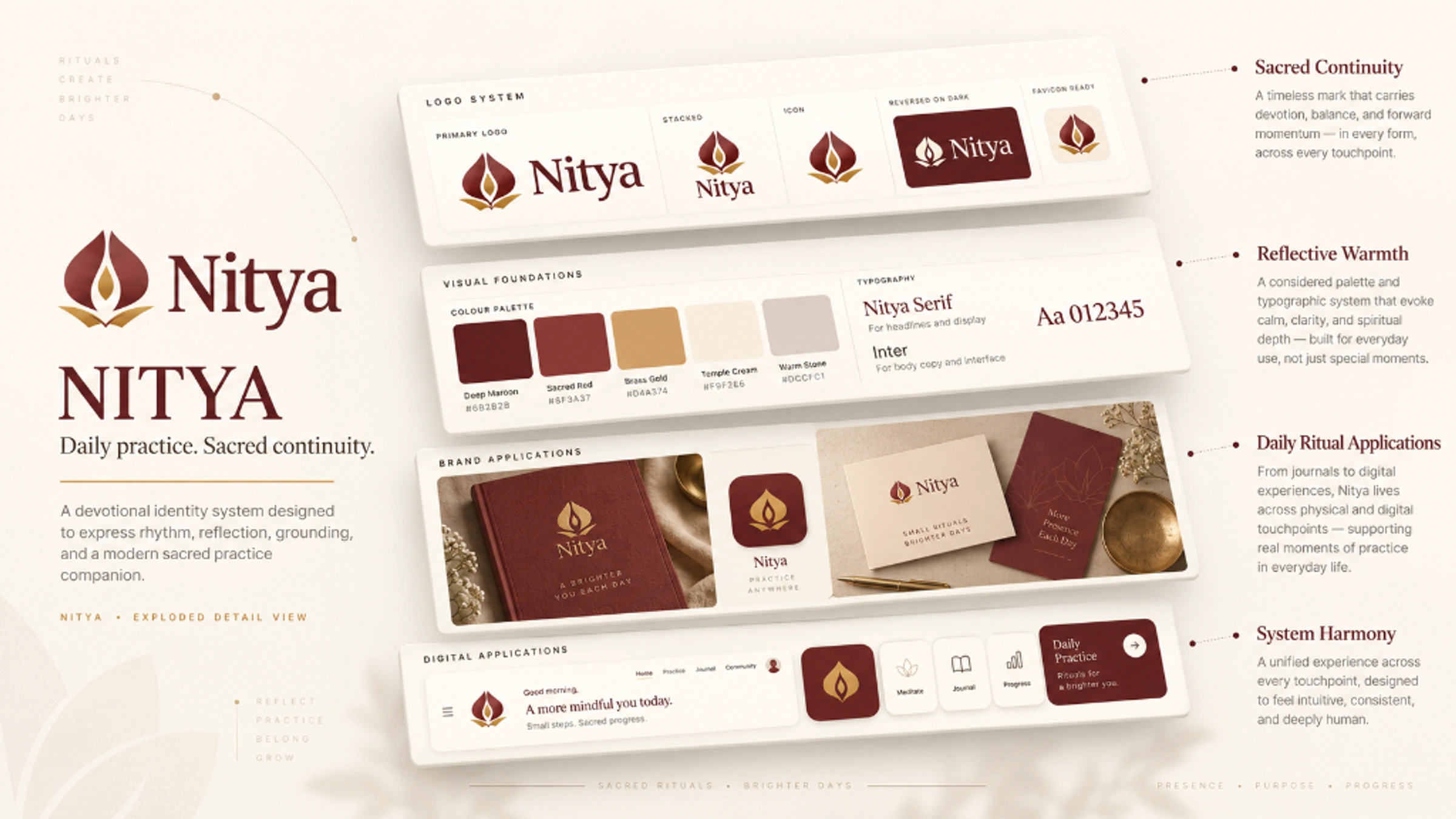
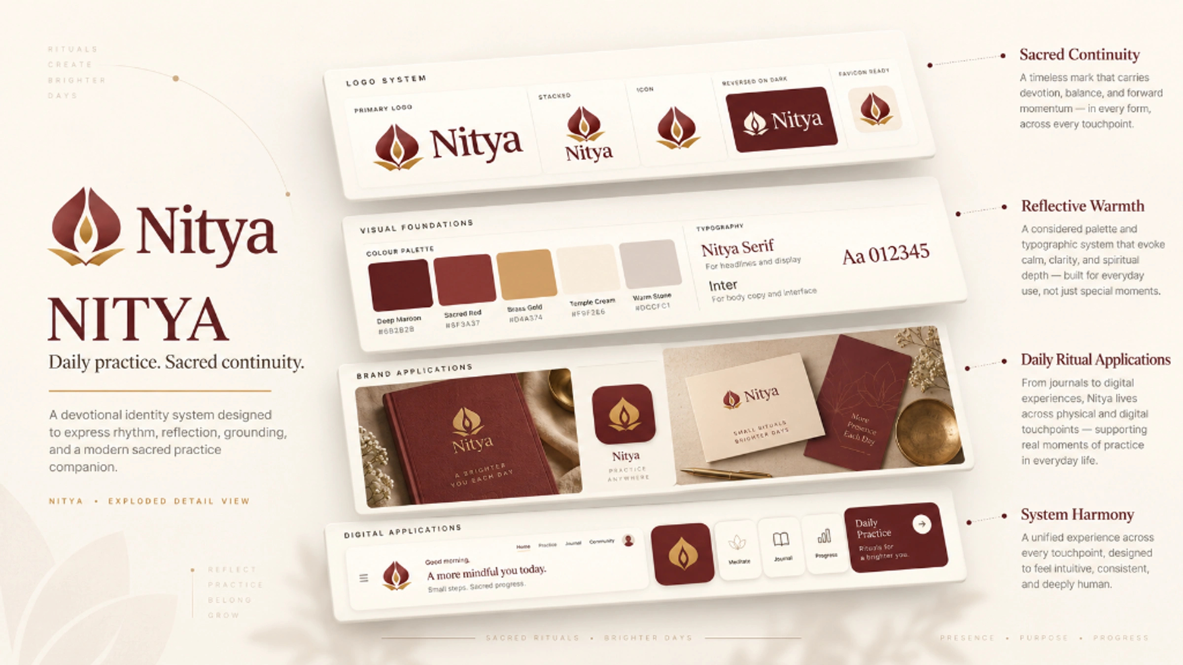
An identity for a devotional companion that brings reading, recitation and daily practice into one considered experience.
Role
Brand strategy, identity and art direction
Focus
Reading · Recitation · Daily continuity
Direction
The Sacred Continuum
The brand
Make it easier to return to what matters.
Nitya began with a concrete ritual: seven recitations a day over a 48-day practice. It grew into a companion for multiple practices, personal PDFs, recitation timers and daily records. The identity needed to belong to that everyday experience: attentive, grounded and welcoming when someone returns.
01
The challenge
Hold meaning without adding clutter.
Reading, counting and devotion each offered a visual starting point. Giving all three equal detail would make a crowded mark. I needed one silhouette that could hold those associations and still work beside a practice title or inside a small app icon.
02
The direction
Let the ritual shape the mark.
The paired forms create an inward rhythm. A central flame gives that rhythm a focus, while an open-book foundation connects the symbol to reading. Maroon anchors the identity; brass draws attention to the centre; ivory gives the whole system room to breathe.
The idea · The Sacred Continuum
Return. Focus. Read.
The two outer forms suggest continuity and a protected centre. The flame represents offering and sustained attention. The open pages tie the mark to the product’s most specific behaviour: reading your own text while completing recitations. The meaning unfolds after the silhouette is recognised.
Paired formsInner flameOpen pages
DESIGN DEVELOPMENT
From several meanings to one silhouette.
01
Find the ingredients
Paired seed forms, a flame and open pages connected the concept to counting, offering and reading.
02
Reduce the visual noise
The early direction felt too shaded. The refinement request prioritised a simpler, flatter silhouette.
03
Resolve the identity
Sacred Continuum became the selected direction, reconstructed as six symbol paths with a serif wordmark.
CONSTRUCTION RATIONALE
The mark uses a 512-unit symbol canvas and a central axis at x = 256. Its balance comes from paired Bézier contours. The source does not establish a golden-ratio construction; the diagrams here explain the final mark rather than claim to be original sketches.
Responsive identity
One idea. Room to adapt.
Primary signature
The full identity for navigation and wide compositions.
Stacked signature
A proportional arrangement for square and centred formats.
Symbol
The core silhouette where the name is already understood.
Single colour
A utility presentation for light surfaces and limited reproduction.
Reverse
A clear signature on a quiet dark background.
FaviconBrowser recognition
App iconA padded silhouette
The colour signature preserves the supplied master. Stacked and single-colour views are presentation adaptations of that same artwork.
Colour system
Warmth with a clear centre.
Maroon
#6F2F2DIdentity and hierarchy
Brass
#B6893FA restrained focal accent
Ivory
#FFFDF8Reading and open space
Warm ivory
#F8F2E7Supporting surfaces
Ink
#2A2420Everyday legibility
These colour roles express the intended character of the brand. The supplied presentation logo retains its maroon and brass gradients; the flat palette gives interfaces and supporting graphics a simpler working system.
Typography
A familiar serif. A clear reading rhythm.
The supplied wordmark uses Georgia. Its familiar, open letterforms give the name an editorial character. The proposed product pairing is Newsreader for English display text and Hanken Grotesk for navigation and data, with script-specific fonts for devotional reading.
Aa
Return to what matters.
Georgia · wordmark specimen
Expressive display
Readable supporting text
Protected wordmark
Clear hierarchy
Identity in use
An identity that accompanies practice.
Art-directed application concept: the identity across a practice screen and journal.
readercountertimercalendarcompleteinsights
A familiar action language
Nitya
Browser identity concept
THE COMPLETE PICTURE
The identity, held together.
Outcome
A coherent identity connecting the reading ritual, the recitation counter and the moments between practices.
Preserved Sacred Continuum master
Colour and single-colour presentation forms
Browser and app assets
Custom interface icons and pattern library
Product and journal application concepts
Bring me the difficult part.
Strategy, identity, and applications built as one system.








 reader
 counter
 timer
timer calendar
 complete
 insights