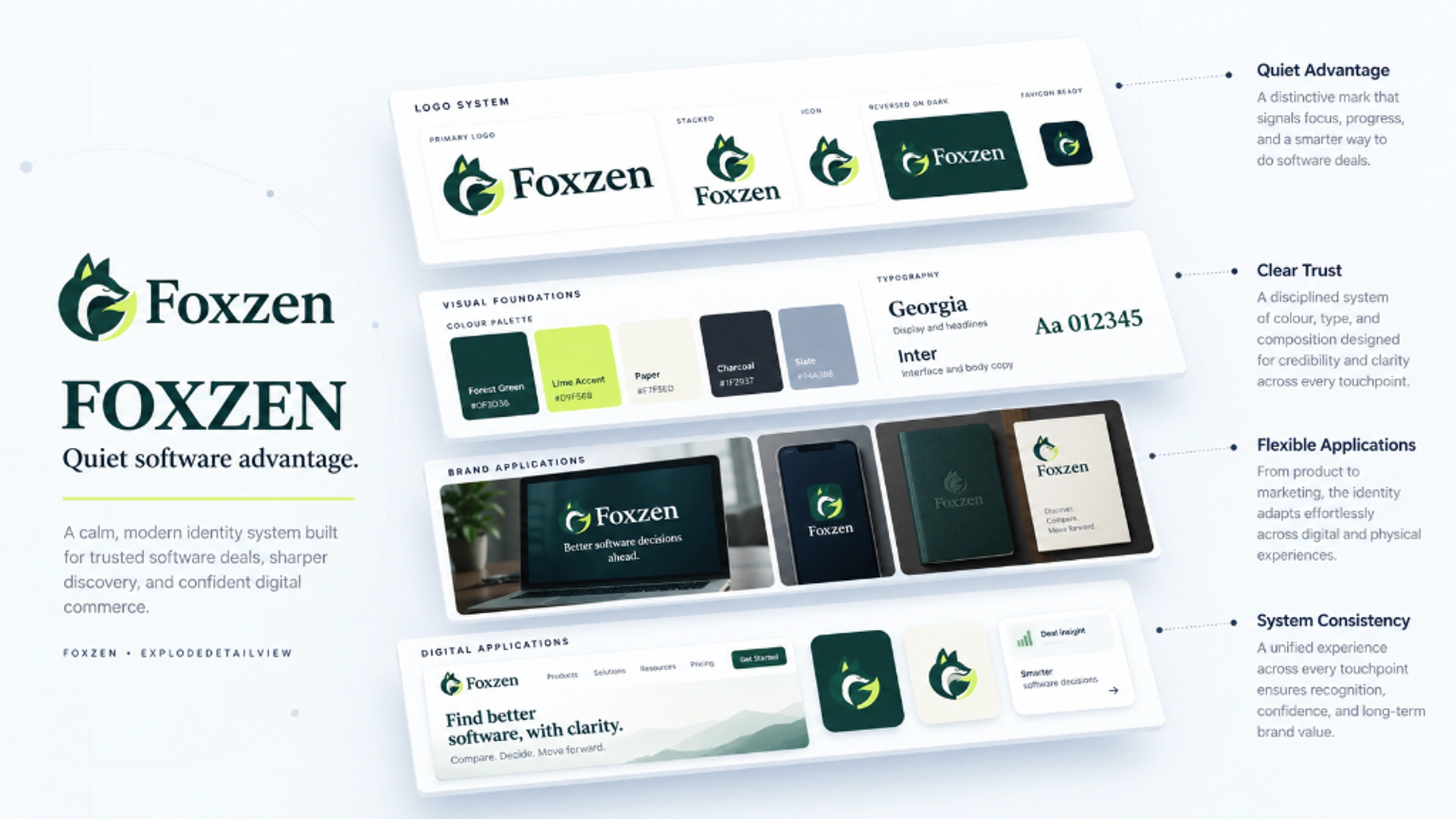
A composed identity for a software store serving students and professionals who want capable tools at a more accessible price.
Role
Brand strategy, identity and art direction
Focus
Software discovery · Students · Professionals
Direction
Quiet Advantage
The brand
Help people choose software with confidence.
Foxzen is a store for software subscriptions and licences. Its audience shares a practical question: does this plan fit what I need, and what am I actually paying for? The brand needed to make value feel considered, with clear communication and a recognisable character.
01
The challenge
Make value feel credible.
A lower price can attract attention, but it cannot explain the product, licence term or renewal conditions. The identity needed enough warmth to be approachable and enough restraint to support careful comparison. The fox had to feel resourceful and helpful.
02
The direction
Choose composure over exuberance.
I explored a smiling, folded-arms companion and a quieter curled fox. Quiet Advantage became the final direction: a compact silhouette, forest-green anchor and sharp citron accent. The trade-off is less overt playfulness; warm, direct copy carries the friendliness.
The idea · Quiet Advantage
Alert in profile. Calm in posture.
A curled fox gathers into a near-circular shape. Pointed ears keep the profile alert, a relaxed eyelid gives it composure, and the rising tail suggests opportunity. The serif wordmark extends that quiet confidence without making catalogue information harder to read.
Alert earsCalm profileRising tail
DESIGN DEVELOPMENT
Two routes. One considered choice.
01
Explore the companion
A smiling mascot with folded arms made the initial route energetic and suited to community content.
02
Explore the quiet fox
A curled silhouette reduced detail and created a stronger compact mark for the store and professional campaigns.
03
Select Quiet Advantage
The final identity pairs the forest-and-citron fox with an outlined serif wordmark and a complete digital asset system.
CONSTRUCTION RATIONALE
The lower-left ring uses an outer radius of 120 units and an inner radius of 120 ÷ φ, approximately 74.164 units. The ears, muzzle, eyelid and tail are optically adjusted Bézier contours. The golden ratio informs this circular relationship; it does not construct the entire fox or prove aesthetic superiority.
Responsive identity
One idea. Room to adapt.
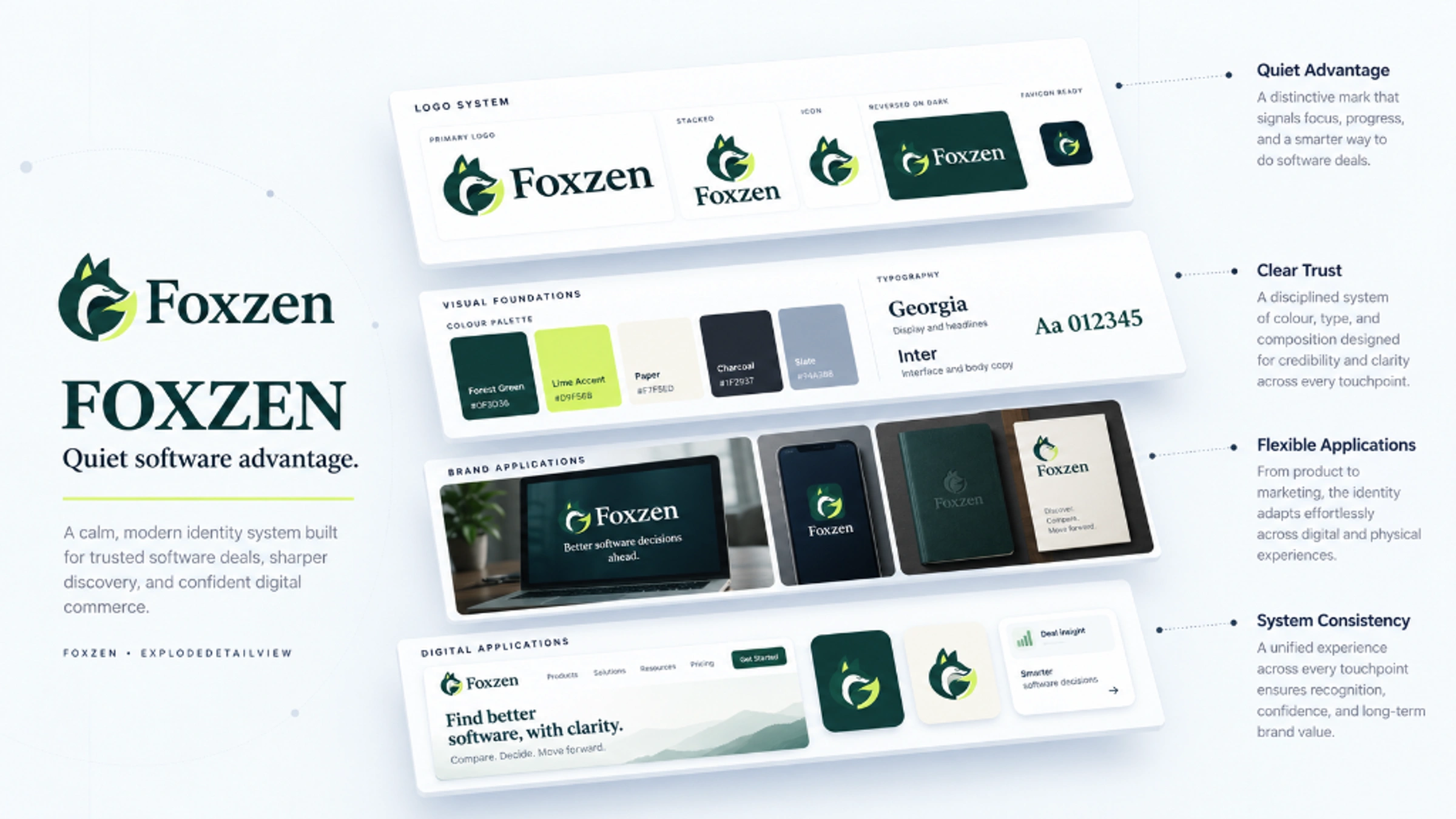
Primary signature
The full identity for navigation and wide compositions.
Stacked signature
A proportional arrangement for square and centred formats.
Symbol
The core silhouette where the name is already understood.
Single colour
A utility presentation for light surfaces and limited reproduction.
Reverse
A clear signature on a quiet dark background.
FaviconBrowser recognition
App iconA padded silhouette
Colour system
A steady anchor. A sharp accent.
Forest
#123C35Identity and primary text
Citron
#D9F36BSelective emphasis
Cream
#F5F4EAOpen, quiet canvas
Soft surface
#DFE6D9Grouped information
Secondary ink
#52675DSupporting text
Forest gives the system weight; citron makes selected moments distinctive; cream keeps the composition open. These are design intentions, not universal colour-psychology claims. In product layouts, forest text carries the information and citron is used sparingly.
Typography
Editorial character. Everyday clarity.
Nimbus Roman Regular provides the foundation for the Quiet Advantage wordmark. The exported logo is outlined to preserve its exact spacing and contours. A neutral system sans serif supports product names, plan terms, prices and forms.
Aa
More tools. More possibility.
Nimbus Roman Regular · campaign specimen
Expressive display
Readable supporting text
Protected wordmark
Clear hierarchy
Identity in use
From the storefront to the small screen.
Art-directed application concept: Quiet Advantage across a software storefront and identity materials.
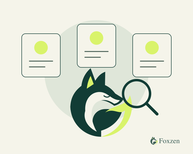
Custom discovery illustration
Foxzen
Browser identity concept
THE COMPLETE PICTURE
The identity, held together.
Outcome
A complete Quiet Advantage system, with a compact fox that can move from the storefront to a browser tab without losing its character.
Final Quiet Advantage direction
Outlined horizontal and stacked logos
Monochrome and reverse masters
Favicon and padded app icons
Patterns, illustrations and campaign templates
Bring me the difficult part.
Strategy, identity, and applications built as one system.