Skip to brand story
All brand workVisionXEdu

AI education · Brand identity · 2026

Learning that meets every student where they are.

An intelligent, approachable identity for an AI first platform helping school students learn with greater clarity across India.

Role
Brand strategy and identity design
Focus
Classes 9 to 12 · NEET exam · AI learning
Direction
Knowledge Spark
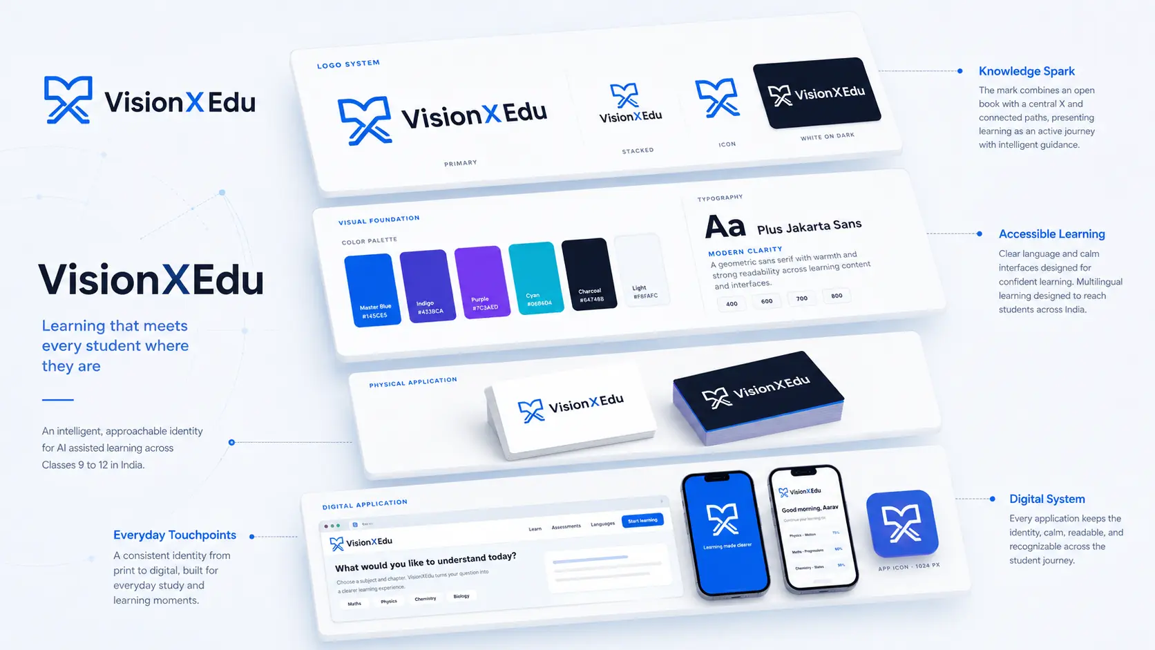
VisionXEdu identity shown across concept applications and brand materials

The brand

AI learning designed to feel useful, trusted, and within reach.

VisionXEdu supports students in Classes 9 to 12 with AI tutors, assessments, personalised learning paths, multilingual support, and interactive learning experiences. The identity needed to represent advanced technology without becoming cold, generic, or difficult to understand.

The challenge

Make intelligence feel human.

The category is crowded with literal brains, robots, caps, and futuristic effects. VisionXEdu needed a mark with educational meaning, technical confidence, and the simplicity to work from a browser tab to a school notebook.

The direction

Clarity before spectacle.

A clean editorial grid, generous white space, calm blue interfaces, rounded product surfaces, and authentic learning moments create a premium identity that still feels approachable.

The idea · Knowledge Spark

An open book becomes a path forward.

The symbol combines an open book, a central X, and rising paths. It expresses knowledge in motion and gives VisionXEdu one memorable shape that can lead both the brand and the product.

VisionXEdu final symbolVXPath

DESIGN DECISIONS

The decisions behind the system.

  1. Connect to learning

    Keep the open-book reading visible in the symbol, with the central X connecting it to the name.

  2. Give the idea movement

    Use rising paths to express learning as progress, while preserving one simple silhouette.

  3. Carry it into the product

    Extend the same mark through navigation, app icons and learning materials, with a clear reading hierarchy.

CONSTRUCTION RATIONALE

The open book, central X and rising paths share a compact silhouette that remains recognisable in small product placements.

Responsive identity

One idea.
Room to adapt.

VisionXEdu: Primary signature

Primary signature

The full identity for navigation and wide compositions.

VisionXEdu: Stacked signature

Stacked signature

A proportional arrangement for square and centred formats.

VisionXEdu: Symbol

Symbol

The core silhouette where the name is already understood.

VisionXEdu: Single colour

Single colour

A utility presentation for light surfaces and limited reproduction.

VisionXEdu: Reverse

Reverse

A clear signature on a quiet dark background.

VisionXEdu browser icon at 32 pixelsFaviconBrowser recognition
VisionXEdu app iconApp iconA padded silhouette

Colour system

Calm enough for focus. Bright enough for progress.

Vision Blue
#145CE5Primary identity
Deep Indigo
#4338CADepth and emphasis
Learning Violet
#7C3AEDSupporting accent
Soft Cyan
#06B6D4Progress and interaction
Charcoal
#0F172AText and dark surfaces
Light
#F8FAFCCalm page surfaces

The palette describes the identity’s visual roles. Colour meaning is a design intention; readable text uses a contrast-checked foreground on each surface.

Typography

Plus Jakarta Sans

A modern geometric sans serif with the clarity needed for learning content and the personality needed for a confident education brand.

Aa

Learn clearly. Move confidently.

Hierarchy study · proposed typography pairing
  • Expressive display
  • Readable supporting text
  • Protected wordmark
  • Clear hierarchy

Identity in use

From first glance to daily learning.

VisionXEdu education campaign with the live homepage displayed inside the laptop
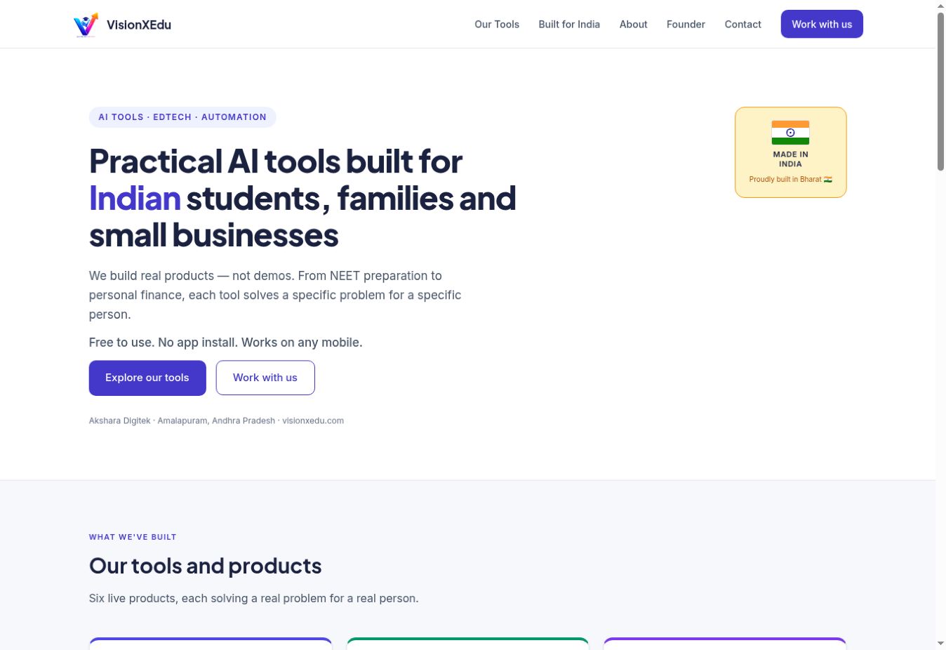
The live VisionXEdu homepage is perspective matched into the laptop display.
The live VisionXEdu homepage
Website navigation and homepage
VisionXEdu
VisionXEdu symbol in a browser presentation
Browser identity concept

THE COMPLETE PICTURE

The identity,
held together.

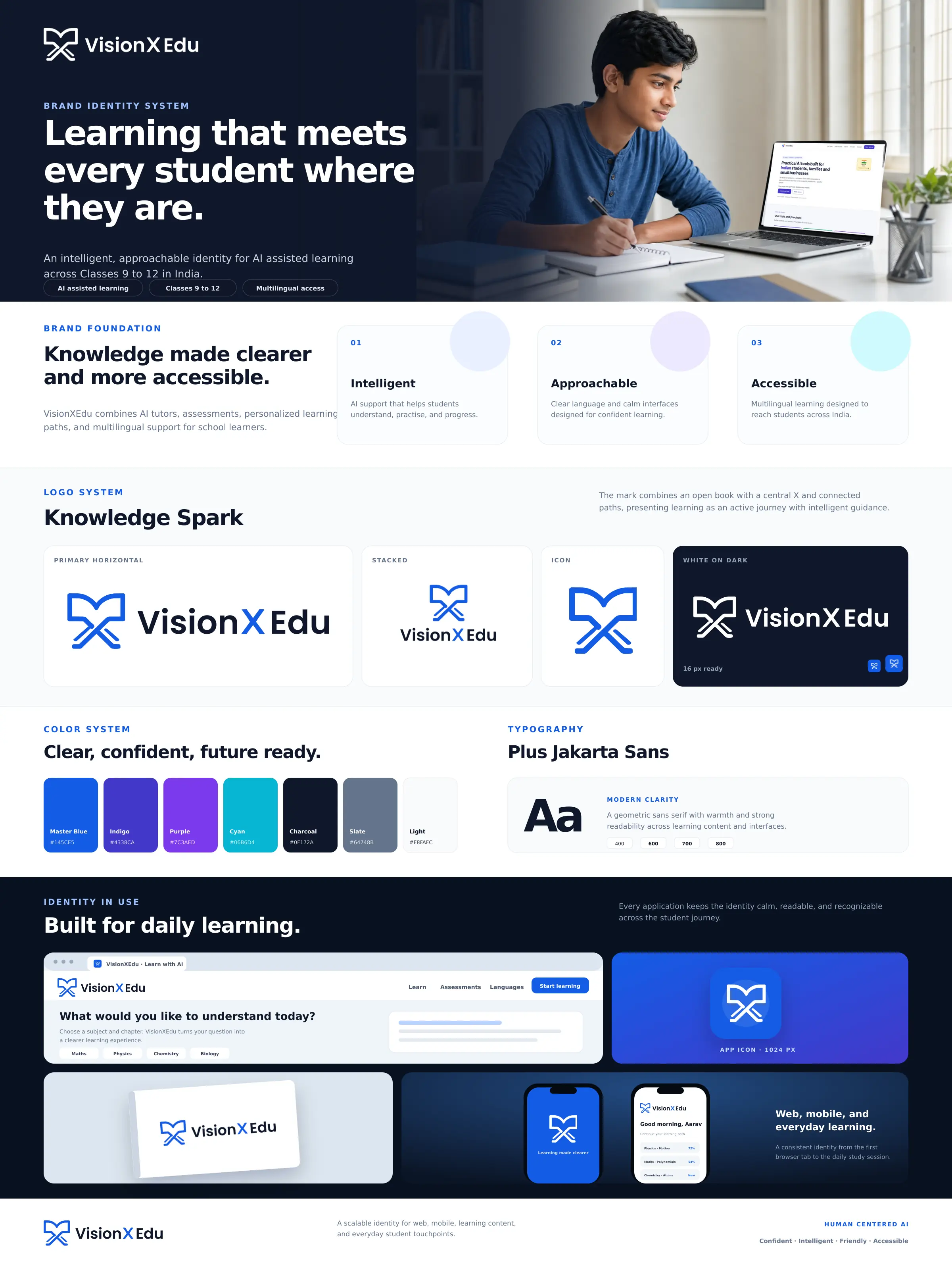
VisionXEdu complete brand board

Outcome

The identity was tested across the learning platform, mobile app, browser icon, notebooks, splash screens, and campaign layouts.
  • Primary and stacked signatures
  • Icon, monochrome, and reverse variants
  • Favicon and app icon
  • Colour and typography system
  • Website and product applications

Bring me the difficult part.

Strategy, identity, and applications built as one system.

Discuss a brand challenge
About KowsikRésuméLinkedInEmail

Next identity

BKM brand system